Hi, I'm Juliana Gómez Consuegra,  chief data scientist and cofounder at Éccole!
Data scientist with a master's degree in Information and Data Science from UC Berkeley and a master's degree in Biological Sciences from Universidad de los Andes. Specializes in bioacoustics, machine learning, product management, and big data, in Python and R. Excels in strategic leadership, creative execution, and communication.
Sample quotes about climate disinformation
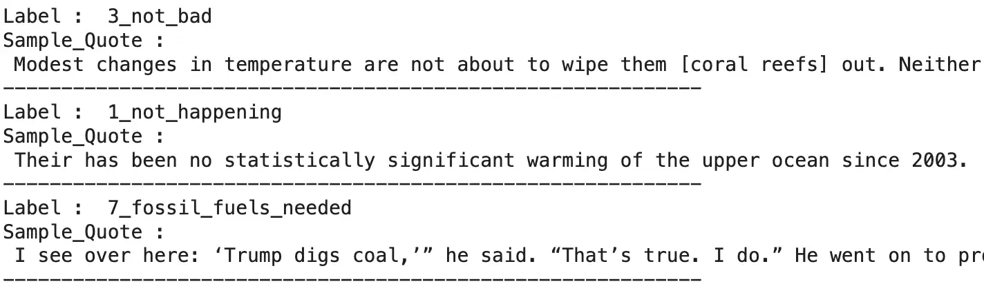
Fine-tuning an accurate and energy-efficient model for predicting climate disinformation in the news
A team of graduate school friends and I recently participated in the Frugal AI challenge designed by Hugging Face's AI and Climate Lead, Dr. Sasha Luccioni, and by Theo Alves da Costa from Data For Good France. The challenge was to train models that were both accurate and energy efficient.
We chose the text-based task, balancing the dataset by using back-translation with the MarianMT model. Our baseline was a random classifier, and then we selected both unsupervised learning models (centroid similarity and K-nearest neighbors) and supervised models (RoBERTa, DistilBERT, ModernBERT and ELECTRA).
Our best-performing model was a fine-tuned ELECTRA model, with 12 unfrozen layers, a learning rate of 5e-5 for 5 epochs, and an Adam optimizer. It obtained an Accuracy of 0.73 and consumed 0.943 Wh (energy consumption was measured with Code Carbon
Tech stack:
- Python
Libraries:
- Tensorflow
- Code Carbon
Audio
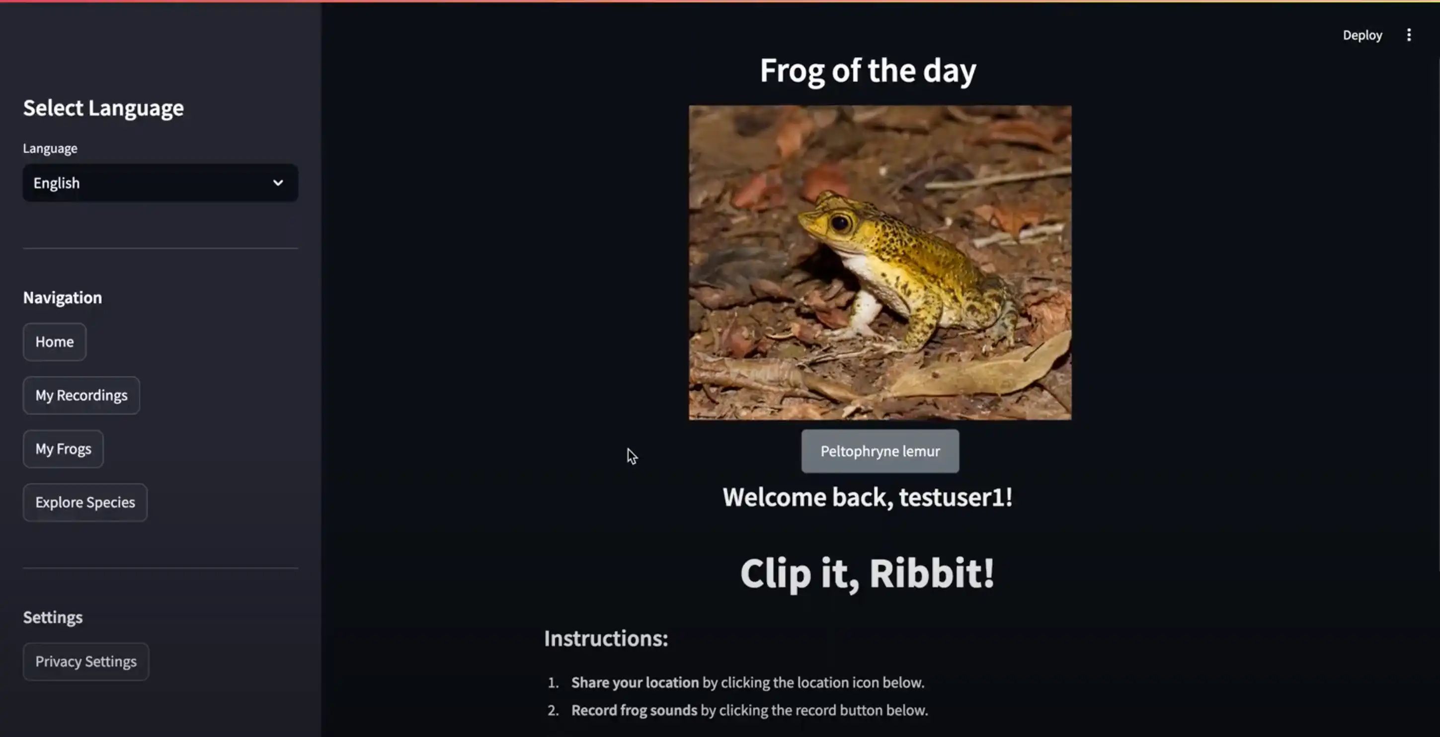
Ribbit - classifying frogs with ML and sound 🐸
My Capstone team and I at UC Berkeley developed Ribbit, a web app for automated frog species identification and classification, which leverages bioacustics and AI.
By simply recording a frog's call, our web app instantly analyzes the call and classifies the species, allowing users to contribute valuable data to global conservation efforts.
As product manager and subject matter expert, I collaborated with experts, organized our team's roles and responsibilities, uploaded our datasets to S3, designed the data pipeline required for preprocessing frog calls, set up our AWS roles, selected the appropriate instances to use on Sagemaker, performed EDA on the data, selected the modeling approach, tried our different models, performed a gap analysis to see where our model was struggling, and designed our website.
Tech stack:
- AWS
- Sagemaker
- Python
Libraries: Librosa
Big data
Taming Turbulence with Machine Learning
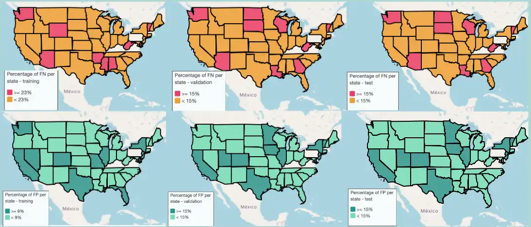
As part of my Machine Learning at Scale course for the Master of Information and Data Science at UC Berkeley, my team (Rachel Gao, Ray Cao, Jenna Sparks, Dhyuti Ramadas and myself) worked on predicting delayed flights at least two hours before departure.
We leveraged a dataset of flight and weather variables between 2015-2019, containing 56 columns and 23.2M records.
I was in charge of exploratory data analysis and feature engineering for the weather variables, sourcing new data for flights and weather for 2020-2023, and performing a gap analysis to identify where our best-performing ensemble model was struggling. The image above shows percentage of false positives by state in the training, validation and test sets in our best-performing model.
Tech stack:
- Databricks
- Spark
Libraries: Matplotlib, Geopandas, Folium
Natural Language Processing
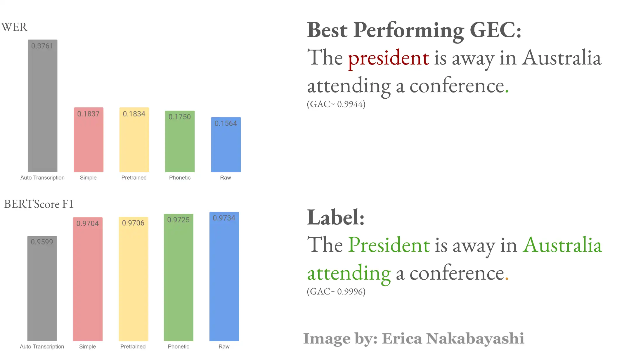
Improving ASR output using a transformed-based grammatical error correction approach
Speech-to-text systems show bias against low-resource languages. My team (Rachel Gao, Erica Nakabayashi and myself) decided to tackle this problem for our final project for our Natural Language Processing with Deep Learning course. I came up with the research idea, and was in charge of research design (along with the rest of the team), gathering some of the data, doing EDA on the Grammatical Error Corrector, experimenting with Parts-of-speech tagging and spellchecking for our model, running RoBERTa models and hyperparameter tuning. I also wrote the final report.
Tech stack:
- Python
- Google colab
- Deep neural networks
- Transformers
Libraries: TensorFlow, NLTK, SpaCy
Statistics
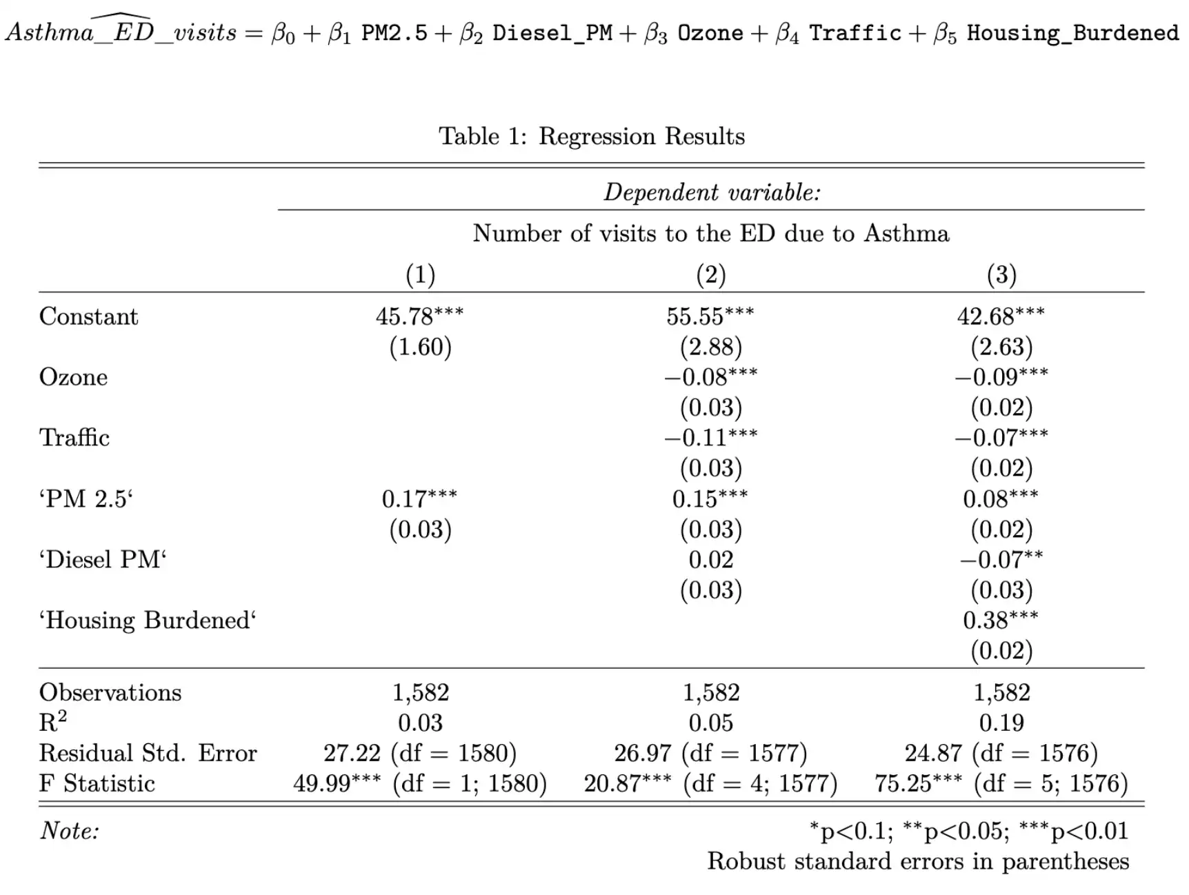
Effect of PM 2.5 on Asthma-related visits to the ER in Los Angeles
Our team (Henry Caldera, Eunice Ngai and myself) chose to estimate the effect of air pollution on the rate of asthma in Los Angeles County by means of a linear regression analysis, for our final statistics project. I came up with the project idea, and was responsible for selecting important variables, designing the presentation, and the whole team worked collaboratively in modeling and writing the report.
Tech stack:
- R
Libraries: ggplot2, tidyverse, stargazer, caret, lmtest, sandwich
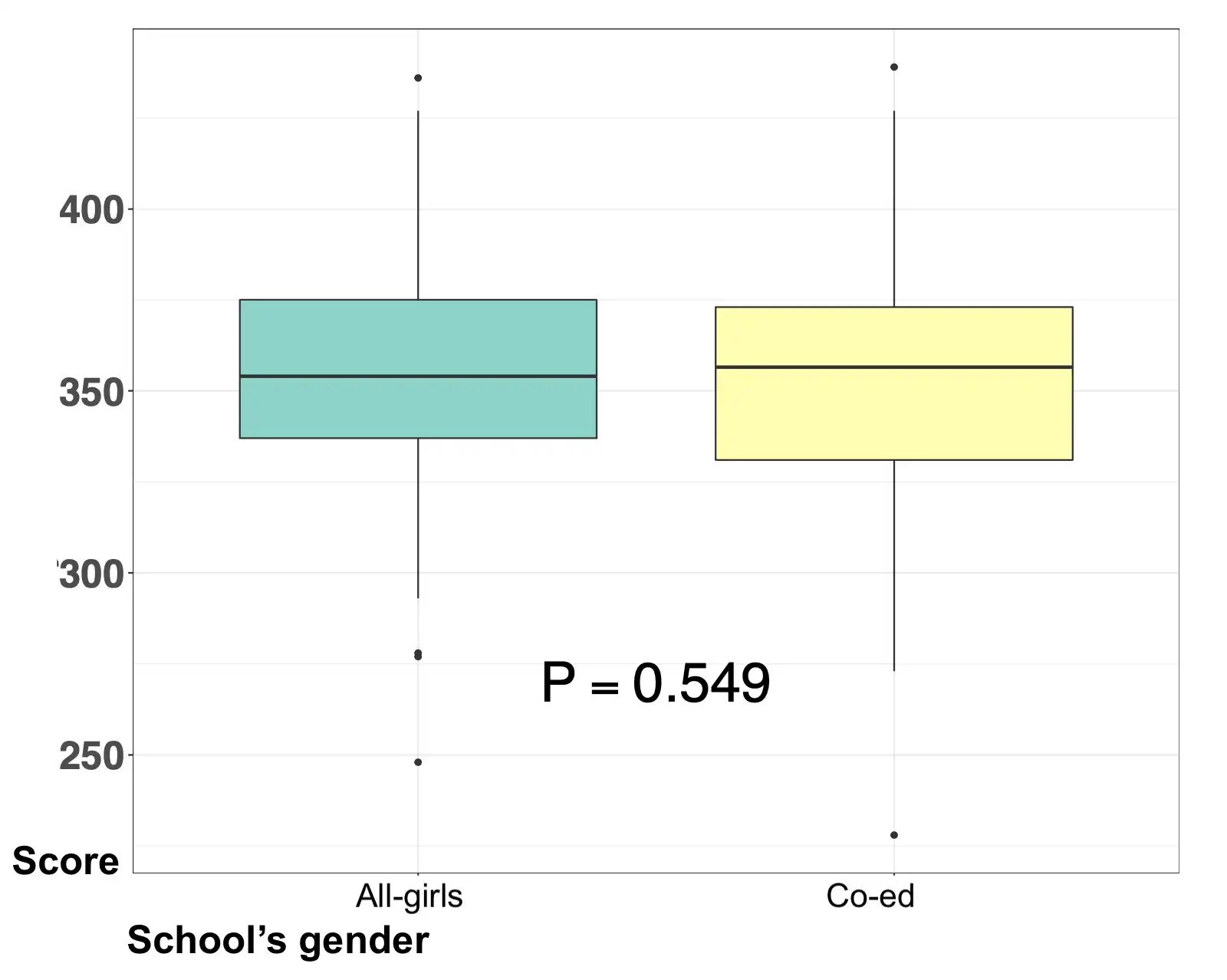
Performance of all-girls K-12 schools vs. co-ed schools on standardized tests
As Chief Data Scientist at my educational consulting company (Éccole!), I spearheaded this project for a client in Bogotá, Colombia. An all-girls school wanted to compare the performance of their students on standardized tests, vs. other girls in co-ed schools. We performed a matching analysis, and found no significant differences in performance between girls at our school of interest and girls at matched co-ed schools.
Tech stack:
- R
Libraries: wakefield, pacman, knitr, Matchit
GIS
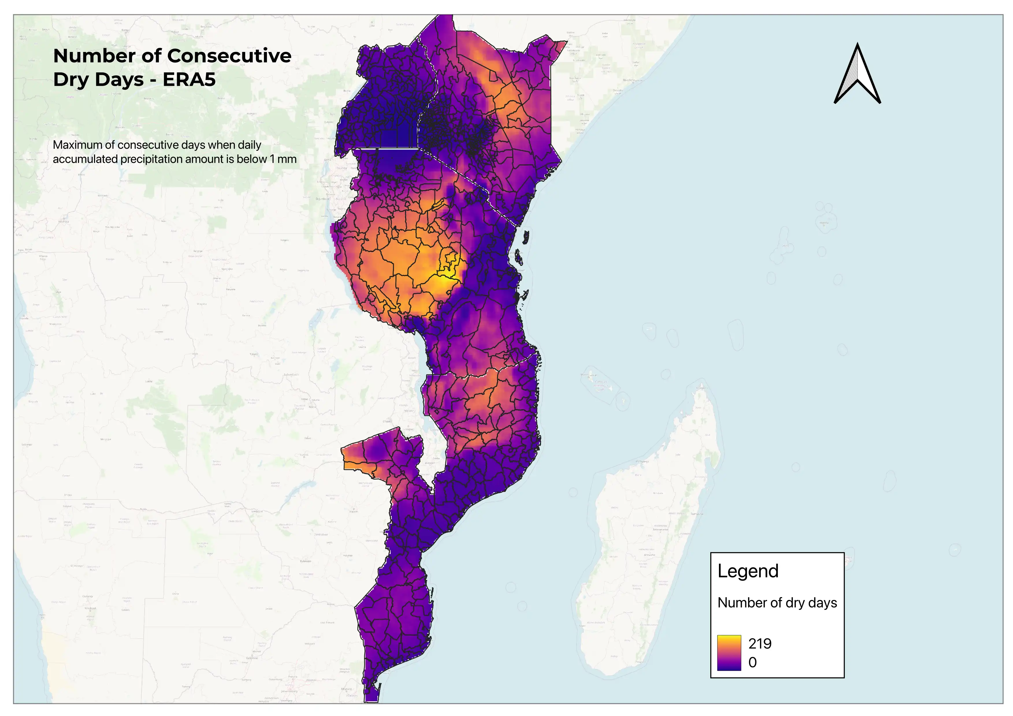
Gender equity and climate change
I collaborated with PhD candidates Silvia Barbereschi (UC Berkeley) and Beatrice Montano (Columbia University) as a Research Assistant in their Gender Equity and Climate Change in Tanzania project. The goal of the project was to determine whether climate change had driven to changes in gender norms in Tanzania.
I generated a dataset based on the land cover dataset from Copernicus Climate Data Store for the years between 2020-2022, and generated summary statistics for variables related to gender in Tanzania and other East African countries (Kenya, Uganda, Mozambique).
I also generated visualizations for the number of consecutive dry days (image shown here), based on a python script I implemented in QGIS to clip raster files in batches for multiple areas.
Tech stack:
- Python
- QGIS
- R
Data visualization
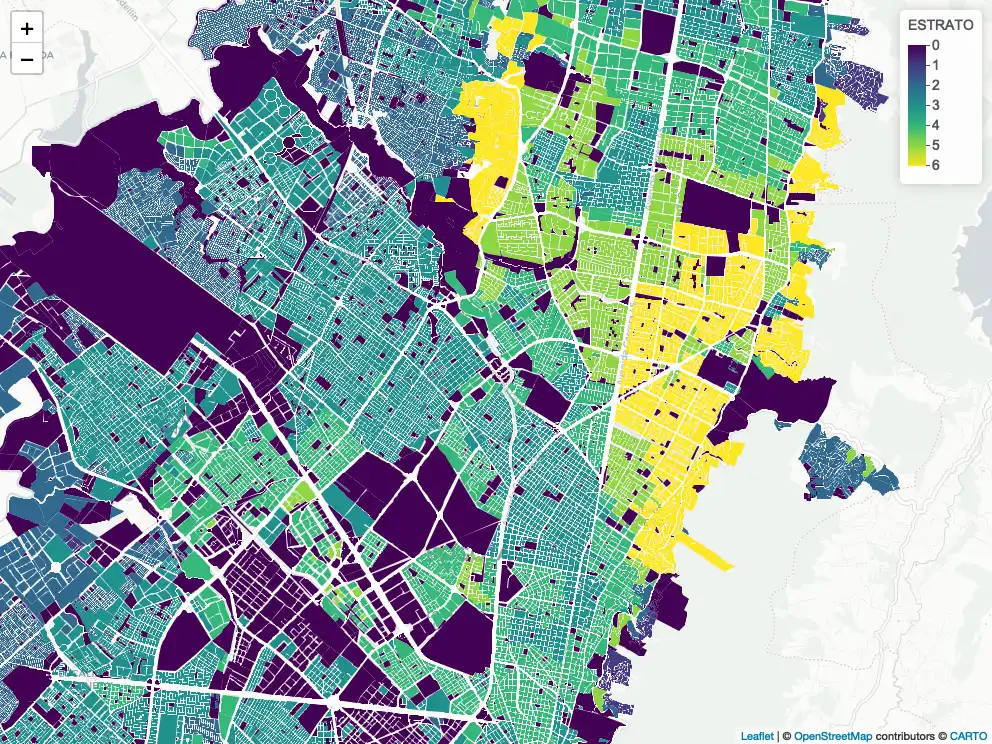
Selecting the best location for a pre-k in Bogotá, Colombia
As Chief Data Scientist at my educational consulting company (Éccole!), I spearheaded this project for a client in Bogotá, Colombia. An educational holding was looking for the best place in Bogotá to place their new pre-k. We included weighted demographic, economical, and competition features, to then filter geographical locations based on space use and performed k-means clustering to cluster locations. We further suggested the appropriate location, based on the client's weighting of the features.
The image to the right shows the price-point by block, ranging from low price point (estrato 1) to a high price-point (estrato 6).
Tech stack:
- R
- K-means clustering
- Georeferencing
Libraries: tidyverse, leaflet, cluster
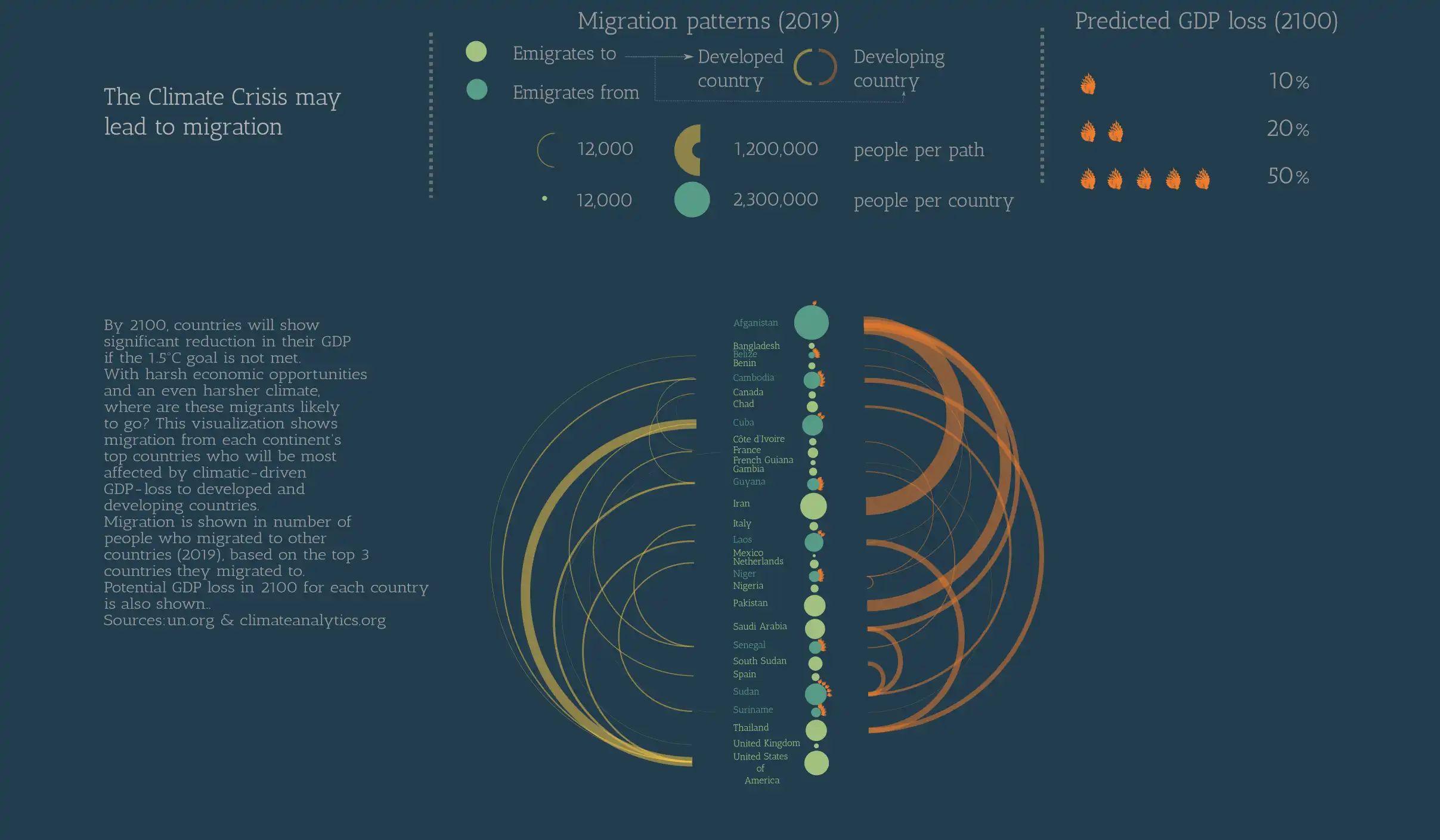
The Climate Crisis May Lead to Migration
I created this visualization as the final project for a Data visualization course from Domestika. I tried to convey how GDP loss and migration could be interlinked.
Tech stack:
- Excel
- Inkscape